![]()
Part One: General Appearance
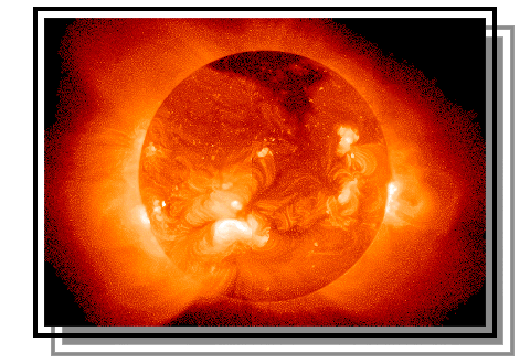
Let's begin by looking at an image of today's
Sun taken by the EIT telescope on the SOHO spacecraft. What do you see? What features stand out? Are they
features that you have seen before? If you were to go outside and look
at the Sun with your naked eye (NOT a good idea!), would it look
like this?
Activity: Make a sketch of what you see in this solar image, being sure to include the most notable or interesting features. Invent names for the different types of features.
![]() WARNING: "Naked eye" means just that --
"naked", as in "unprotected and vulnerable". NEVER look straight
at the Sun with your unprotected eyes. You can lose your eyesight, and
YOU WILL NEVER GET IT BACK. There are some safe ways to observe
the Sun -- find out about these safe methods BEFORE you look at the Sun.
WARNING: "Naked eye" means just that --
"naked", as in "unprotected and vulnerable". NEVER look straight
at the Sun with your unprotected eyes. You can lose your eyesight, and
YOU WILL NEVER GET IT BACK. There are some safe ways to observe
the Sun -- find out about these safe methods BEFORE you look at the Sun.
![]()
Part Two: A Changing Look, or a Constant Face?
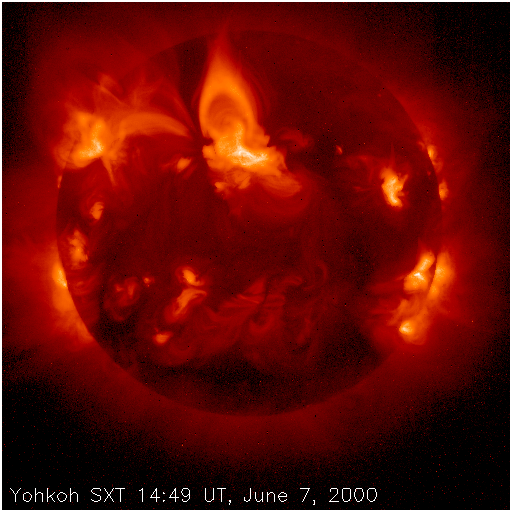
Look again at the image of today's Sun.
Do you suppose the Sun always looks like this?
Here are some pictures of the Sun in X-rays produced by Yohkoh SXT to show how the Sun appeared on several other dates.
Compare the images from several different dates. Is there any difference? Do you suppose
there is any pattern to the Sun's appearance through time?
Activity: To look for subtle patterns in data, scientists often plot their data graphically -- pictures show many things that are easily overlooked in tables of numbers. Try making these two graphs to see if any patterns are noticable:
![]()
Part Three: Long-Term Cycles
Compare your plots from Part Two to
these two graphs.
The first shows how the
number of sunspots has changed, day to day, over the last 250 years.
The second shows
the solar latitude of
sunspots during the course of the last 125 years. (There is a
relationship between X-ray active regions and sunspots, so there should be
some relationship between your graphs from Part Two
and these longer-term records.) How
do your graphs
compare to the longer record? Can you predict, even roughly, what the Sun
will look like next year? When you graduate from college? On your
thirtieth birthday?
Activity: Download an image taken on June 7, 2000 .
Compare it to the other images you have. Where in the solar activity
cycle do you think the sun was when this image was taken? Near minimum/maximum activity?
Increasing/Decreasing activity? You can find lots of recent images in the
First
Light archive at URL:
Test yourself: Here is another X-ray image. There is no date stamped on the image; it was made sometime between 1991 and 1995. Try to estimate when this picture was taken, based on the amount and location of activity.
The "Mystery Image" in the above Test Yourself activity is randomly
selected from a set of twelve solar X-ray pictures. Each time you reload
the "Mystery Image" you may get a different picture! A composite
poster of all twelve
images in
the set is viewable here,
and you can
order your own full-size poster at URL:
![]()
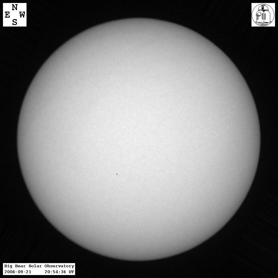
Now here is a visible-light
picture of the Sun, and an X-ray picture taken on the same day
(1992Jan23). Notice the
location of the dark sunspots in the
visible-light picture (often called "white light"), and the location of the
large active regions in the X-ray picture. Is there any relationship? The
visible-light image shows what you would see if you simply walked outside and
looked up (although you would have to SHIELD YOUR EYES with a
protective filter). Since this is the visible layer of the Sun, it is
called the "photosphere," or "sphere of light." The corona (or "crown")
lies much higher, many kilometers above the photosphere. See the above
warning about viewing the Sun.
Part Four: Connection to the Visible Sun
Except for today's image from SOHO, the images we have examined so far
are all X-ray pictures. They show the
apperance of the hot outermost layer of the Sun's atmosphere. But since
X-rays are invisible to human eyes, you can't see the coronal structures
simply by walking outside and looking upwards.
Link to an Explanation
Activity: Here are a bunch of
white-light and X-ray
pictures of the Sun. The white-light images are stamped with the date and
time of the observation; the date stamps have been left off of the X-ray
images. Use what you have learned about magnetic active regions to match
the X-ray pictures with the respective simultaneous white-light images.
If you could walk outside right now and observe the visible Sun, could you make predictions about the appearance of today's Sun in invisible X-rays?
Test yourself: We have provided you with an image of today's Sun made in ultraviolet rays (which are not as high energy as
X-rays but are still invisible to the human eye).
Make a guess about what the visible-light Sun looks like today. Make a
sketch of your prediction. Then
download
a white-light picture of today's Sun and compare: how accurate was your
prediction? One site from which you can get a daily (depending on
local weather) solar white-light image is the Big Bear Solar
Observatory in California, at URL:
NOTE: All of the X-ray images were taken by the Soft X-ray Telescope (SXT) on the Yohkoh solar observing satellite. Yohkoh/SXT has made more than two million X-ray pictures of the Sun since its launch in 1991, and continued making pictures until December if 2001. For most of 1992, SXT also made pictures in visible light. Towards the end of 1992, however, the harsh radiation from the Sun began to take its toll on the camera and it is no longer used for white-light pictures. You can see the effects of the damaging radiation in some of the 1992 pictures; look for a dark "shadow" near the right-hand edge of the Sun.
![]()
| Lesson designed by the YPOP Team
For questions about this lesson, please contact David McKenzie |  Selected by the sciLINKS program, a service of National Science Teachers Association. Copyright 2001. |